This site is supported by our readers. We may earn a commission, at no cost to you, if you purchase through links.
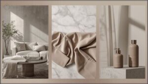
Ash doesn’t announce itself. It sits quietly between gray and beige, refusing to commit to either extreme. You’ve seen it everywhere—the color of burnt wood, overcast skies, and minimalist interiors—but pinning down its exact hue feels impossible.
That’s because ash shifts with context. Lighting changes it. Texture transforms it. What reads as pale gray in one room darkens to charcoal in another. This chameleon quality makes ash both frustrating to define and invaluable to designers who need a neutral that adapts without fading into nothingness.
Understanding ash means learning its technical codes, recognizing its variations, and knowing exactly when its quiet restraint becomes your strongest design tool.
Table Of Contents
- Key Takeaways
- What Color is Ash?
- Ash Color Variations and Shades
- The Psychology and Symbolism of Ash
- Ash in Design and Aesthetics
- Color Harmonies: What Goes With Ash?
- Technical Details of Ash Color
- Practical Uses and Inspiration for Ash
- Frequently Asked Questions (FAQs)
- Can ash hair color be achieved on all hair types?
- How long does ash hair color typically last?
- Can ash hair color be damaging to the hair?
- Are there any special maintenance requirements for ash hair color?
- What natural materials produce ash-colored pigments?
- Does ash color appear differently on various materials?
- How does lighting affect ash color perception?
- What industries most commonly use ash tones?
- Can ash color be reproduced in natural dyes?
- Conclusion
Key Takeaways
- Ash is a neutral color sitting between gray and beige with hex code #C6C3B5, characterized by cool undertones and low saturation that shifts appearance based on lighting and surrounding materials.
- The color’s technical specifications translate across formats (RGB: 198, 195, 181; CMYK: 0, 2, 9, 22) and span variations from pale wood ash to dark charcoal, each defined by combustion temperature, moisture content, and mineral composition.
- Ash functions as a design anchor because it provides visual balance without competing for attention, making it valuable across interior design, fashion, branding, and digital media where adaptability matters more than boldness.
- Creating effective ash-based palettes requires using ash as 60-70% of your design space while pairing it strategically with complementary colors like navy, forest green, or coral to achieve depth and intentional contrast.
What Color is Ash?
Ash is a soft, neutral color that lives somewhere between gray and beige. It carries the quiet warmth of spent embers—understated, elegant, and surprisingly adaptable.
Ash is a soft neutral between gray and beige—understated, elegant, and surprisingly adaptable like the quiet warmth of spent embers
Let’s break down what defines this color, from its visual character to its precise technical codes.
Visual Description of Ash
Ash reads as light to medium gray with cool undertones. You’ll notice its matte finish lacks reflective highlights, giving it a soft, subdued presence. In natural light, ash color variations shift—sometimes appearing bluish-gray, other times warming slightly. Light ash brown or ash gray tones depend on lighting and texture.
Gray undertones affect color perception, while minimal light reflection creates that characteristic understated elegance you recognize instantly.
Understanding the importance of clear science writing, such as using proper citation styles, can improve the presentation of color theory concepts.
Ash Color Hex, RGB, and CMYK Codes
Behind every digital shade lies a precise numeric formula. Ash color hex code is #C6C3B5, translating to RGB values of (198, 195, 181). In CMYK format for print, you’ll use 0% cyan, 2% magenta, 9% yellow, and 22% black. These code formats guarantee accurate color conversion across design palettes:
- HEX: C6C3B5
- RGB: 198, 195, 181
- CMYK: 0, 2, 9, 22
- HSV: 49°, 9%, 78%.
Understanding research methodology basics is vital for analyzing digital design elements.
Where Ash Sits on The Color Spectrum
Once you’ve locked down the hex code, you’ll want to map ash’s position on the color spectrum. Ash sits between white and black on the grayscale, landing as a light-to-medium gray with cool gray undertones.
Its low color saturation keeps it firmly in neutral tones territory. Light reflection values hover mid-range, creating ash hues that balance warmth and coolness according to color theory principles.
Ash Color Variations and Shades
Ash isn’t just one color. It spans a spectrum from pale, chalky tones to deep, charcoal-laden hues.
Let’s look at the most common variations, how they differ in lightness, and where ash stands compared to similar neutrals.
Common Ash Color Variants (e.g., Wood Ash, Wet Ash)
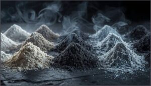
You’ll find ash isn’t a single shade. Wood Ash shows light gray to pale white. Wet Ash darkens to charcoal. Volcanic Ash brings cooler tones. The variance depends on three factors:
- Combustion temperature affects color intensity
- Moisture content shifts tone darker
- Mineral composition introduces subtle blue-gray shifts
Dark Ash appears in damp conditions. Light Green Ash emerges from specific wood types.
Lighter and Darker Tints of Ash
Lightness values define your palette control. Pale Ash sits at 70-75% brightness—think soft neutrality for backgrounds. Dark Ash drops to 35-50%, anchoring layouts with quiet weight.
Tint Variation emerges as you shift saturation: Light Green Ash carries subtle warmth from hardwoods, while Wet Ash cools toward blue-gray depths.
Each Shade Depth adjusts your Neutral Balance. The Ash Gradient you create depends entirely on pigment chemistry and moisture exposure.
How Ash Compares to Similar Colors
Gray Undertones separate Ash from pure neutrals. Ash carries warmer whispers than stark Gray—closer to Greige territory. Taupe holds more brown; Ash stays cooler.
Against White, Ash provides gentle Color Contrast without drama. Black pushes too dark. Slate leans bluer.
These Ash Variations matter when you’re building Design Harmony across Neutral Tones—each shifts perception slightly, changing your material’s final visual weight.
The Psychology and Symbolism of Ash
Ash carries weight beyond its physical presence. It speaks to balance, neutrality, and the quiet wisdom that comes from transformation.
Understanding what ash means—culturally, emotionally, and symbolically—helps you wield it with intention in your work.
Emotional and Cultural Associations
You’ll find ash color carries weight across cultures—it’s the color of ashes, remembrance, and sobriety in many traditions. Its emotional impact leans toward calm and practicality, making it a go-to in design psychology.
The symbolic meaning? Resilience and endurance. In modern branding, ash conveys refined minimalism, proving color perception shapes how you experience visual spaces and artistic expression.
Ash as a Symbol of Balance and Neutrality
Ash sits at the heart of neutral color theory—a bridge between extremes. This ash gray doesn’t lean warm or cool, which gives you color balance that feels innate.
You’ll see its symbolic neutrality anchoring design harmony in spaces craving calm without coldness. The calming effects come from its refusal to demand attention, letting other elements breathe.
In neutral colors, ash is the diplomat—steady, fair, grounding.
Ash in Historical and Modern Contexts
Throughout history, ash symbolism has marked mourning and renewal—from Christian Ash Wednesday rites to Japanese raku glazes fired centuries ago. You’ll find historical ash in medieval manuscripts and Victorian soot-stained stone.
Today’s modern ash aesthetics dominate tech branding and minimalist interiors, where ash gray signals sophistication. The cultural significance hasn’t faded; it’s evolved from sacred ashes to sleek design.
Ash in Design and Aesthetics
Ash works across design disciplines because it grounds without competing. You’ll find it anchoring interiors, elevating fashion choices, and shaping brand identities that need to feel both refined and approachable.
Here’s how designers put this quiet color to work in three distinct spaces.
Ash in Interior Design and Home Decor
You’ll find ash accents transform spaces into calm sanctuaries. This neutral gray—often hex A7A9AD—balances warm woods and cool metals effortlessly.
In interior design, ash color schemes create timeless home decor that feels both refined and inviting. Pair it with white trim for brightness or navy for depth.
Current interior trends favor ash on cabinetry and walls, offering design inspiration that maximizes perceived space while preserving design elements that endure.
Ash in Fashion and Style
You’ve likely spotted ash gray sweeping runways and retail racks—this cool, desaturated neutral anchors fashion trends with quiet confidence.
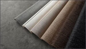
Ash textiles read slightly cooler than taupe, pairing beautifully with navy, white, or peach ash for unexpected style evolution. Color combinations favor ash’s restraint: pair it with muted pastels or black for timeless design inspirations that resist fleeting fads.
Ash for Branding and Digital Media
Just as ash works in fashion, it thrives in digital branding—you’ll find this neutral background anchoring visual hierarchy without competing for attention.
Ash typography over white ensures color accessibility, while ash color palettes ground brand and web design with elegant restraint.
For digital media and art, ash delivers digital design inspiration that feels modern yet timeless, letting your boldest elements claim the spotlight.
Color Harmonies: What Goes With Ash?
Ash doesn’t work alone. It needs the right partners to realize its full potential in your designs.
Let’s look at the colors that harmonize with ash and how you can build palettes that feel balanced, intentional, and complete.
Complementary and Analogous Colors for Ash
You’ll find ash works best with warm taupe for soft contrast—think complementary colors that don’t shout. Analogous hues like gray-beige and cool gray-blue create neutral palettes with visual balance.
For design contrast, pair ash accents with high-saturation coral or cobalt.
Your color scheme gains depth when you layer multiple ash tones, letting the color palette breathe while maintaining harmony.
Creating Palettes With Ash
You anchor your palette balance with ash as a neutral background—60-70% of your design space. Gray scale variations let you control visual aesthetics and design without overwhelming viewers.
- Start with ash at C6C3B5 for your base layer
- Add 10-20% accent colors for color palette creation
- Use tints (add white) or shades (add black) for depth
- Test color schemes and palettes across digital and print media
This ash color theory approach ensures design versatility while maintaining design elements and principles that guide the eye naturally.
Popular Color Combinations Featuring Ash
You achieve design balance when you pair ash with navy blue for maritime sophistication. Forest green grounds ash in nature-inspired neutral palettes. Warm taupe softens your ash accents in minimal interiors. Charcoal black creates high-contrast color schemes and palettes for modern branding. Soft blush adds subtle warmth to ash neutrals in textiles.
These color combinations and palettes demonstrate ash color harmony across design and art applications, strengthening color and artistic expression.
Technical Details of Ash Color
You can’t design with Ash unless you speak its language. That means knowing the exact codes your software needs—hex for web, RGB for screens, CMYK for print.
Here’s how to translate Ash into any format and create precise variations that hold up across every platform.
Digital Representation (Hex, RGB, CMYK, HSV)
Want to translate ash into digital formats? Your design software speaks in numbers. Hex Code C6C3B5 defines ash precisely.
RGB Values break it down: 198 red, 195 green, 181 blue. CMYK Systems use 0% cyan, 2% magenta, 9% yellow, 22% black for print. HSV shows 49° hue, 9% saturation, 78% brightness.
These Color Coding Systems guarantee your ash looks identical across screens and printed materials.
Closest Web Safe Colors
Finding the right digital match brings color calibration into sharp focus. Ash doesn’t map perfectly to Web Safe standards, but you’ve got solid options for consistent display rendering.
- CCCCCC: Closest neutral gray approximation in Web Color Codes
- BEBAA7: Alternative HEX match preserving ash’s warm undertone
- C0C0C0: Reliable option for Neutral Backgrounds across devices
- BDBDBD: Balanced Digital Gray Shades for stable screen reproduction
These Digital Color Representation choices guarantee your Ash Color renders consistently.
Creating Tints and Shades of Ash
Controlling Ash Tinting and Shade Creation involves adjusting lightness values systematically. By shifting RGB channels proportionally, you can achieve various effects: raising all three channels creates tints toward near-white, while dropping them builds color depth into charcoal territory. Neutral undertones remain stable when hue angles are preserved during digital rendering.
| Adjustment | RGB Effect | Result |
|---|---|---|
| Add white | Increase all channels | Lighter tints (D0D3D6) |
| Add black | Decrease brightness | Darker Ash Gray shades |
| Mid-range | Moderate saturation | HEX BEBAA7 balance |
| Control depth | Adjust Color Saturation Levels | Predictable Ash Color variants |
Practical Uses and Inspiration for Ash
Ash works across creative fields. You can use it in art, digital design, and real-world projects. Here’s how to apply it and spot where it’s trending now.
Ash in Creative Projects and Art
Ash pigments appear in everything from Renaissance frescoes to contemporary digital art. You’ll find this neutral anchoring minimalist illustrations, modernist architectural renderings, and monochrome photography. Its muted warmth bridges analog and digital mediums seamlessly.
- Graphic design uses ash for elegant branding
- Digital rendering captures realistic stone textures
- Color theory places ash as visual balance
- Artistic expressions favor ash for contemplative work
- Creative inspirations emerge from ash’s quiet versatility
Tips for Incorporating Ash Into Designs
Start with ash as your neutral foundation. Pair it with warm wood tones or cool steel accents depending on your project’s mood.
In graphic design, ash color codes anchor minimalist aesthetics without flattening depth. For branding strategies, combine ash with one bold accent—terracotta or slate blue—to maintain sophistication.
In digital design projects, ash creates breathing room, letting color theory guide where your eye travels next.
Trends Featuring Ash in 2025
Throughout 2025, you’ll notice ash dominating sustainable ash designs and modern ash interiors. The ash color forecast points to earth-conscious aesthetics that balance technology with nature.
Watch for:
- Biophilic workspaces blending ash digital aesthetics with living greenery
- Fashion runways where ash fashion trends anchor capsule collections
- Minimalist branding using ash tree-inspired palettes for authenticity
These design trends reflect our collective craving for grounded, timeless spaces.
Frequently Asked Questions (FAQs)
Can ash hair color be achieved on all hair types?
Most hair textures can handle ash tones—ironically, the biggest challenge isn’t your hair type but its porosity issues and existing damage.
Darker bases need serious color correction, while maintaining those cool ash shades requires committed maintenance routines.
How long does ash hair color typically last?
Your ash tone usually holds strong for 4 to 8 weeks. Hair porosity, washing frequency, and UV exposure directly influence color longevity factors.
Use sulfate-free products and fade prevention methods to extend ash hair care tips effectively.
Can ash hair color be damaging to the hair?
Up to 30% of cuticle integrity loss occurs during bleaching for ash hair. You’ll face hair porosity issues if proper conditioning isn’t maintained.
Chemical reactions and ash dye effects depend entirely on your chosen products and aftercare routine.
Are there any special maintenance requirements for ash hair color?
To maintain your Ash Tone Maintenance, use sulfate-free shampoos and purple-tinted conditioners weekly. This routine will also help with Color Fade Prevention.
Heat styling accelerates pigment loss, so minimize it. Schedule touch-ups every 4–6 weeks for consistent Hair Color Preservation.
What natural materials produce ash-colored pigments?
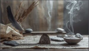
You’ll find ash-colored pigments in charred wood, bone ash, calcined minerals like limestone, and volcanic deposits.
Charcoal pigments from coconut shells or hardwoods create deep gray tones when properly processed and ground.
Does ash color appear differently on various materials?
Yes, ash shifts across materials. Wood lightens it. Metal reflects surroundings. Concrete darkens tones.
Surface texture and lighting effects alter ash perception dramatically.
Material variance creates color shift you’ll notice immediately in design work.
How does lighting affect ash color perception?
Lighting effects reshape ash perception dramatically. Color temperature shifts ash between warm and cool tones. Illumination angles reveal hidden undertones. Spectral shifts alter brightness and color properties. Your ash color codes change visually under different lighting conditions.
What industries most commonly use ash tones?
Interior spaces and fashion trends favor ash for its understated versatility.
Branding strategies and web design rely on its modern neutrality.
Automotive design and graphic elements use ash to signal refinement without distraction.
Can ash color be reproduced in natural dyes?
Plant-derived natural dyes can achieve ash-like tones using iron mordants with tannin-rich sources.
Your results depend on fiber type, pH control, and mordant concentration.
Expect batch variability and colorfastness challenges when replicating precise ash color codes digitally.
Conclusion
What makes a color memorable? Ash proves it’s not about brightness or boldness—it’s about adaptability. You now know what color is ash, from its precise hex codes to its psychological weight.
You’ve seen how it shifts across materials, lighting, and contexts. That knowledge turns ash from background noise into a deliberate choice.
Next time you reach for a neutral, you won’t just see gray. You’ll see possibility wearing restraint.
- https://byjus.com/chemistry/rusting-iron-prevention/
- http://www.home-designing.com/green-bedroom-interior-design-ideas-photos-tips-accessories
- https://h-o-m-e.org/what-is-a-subtopic/
- https://mobile.collierschools.com/research/3%20Organize%20Information/3-1%20Identify%20Subtopics.html
- https://www.britannica.com/dictionary/subtopic


